Bright Winter Seasonal Color Analysis
BRIGHT & COOL


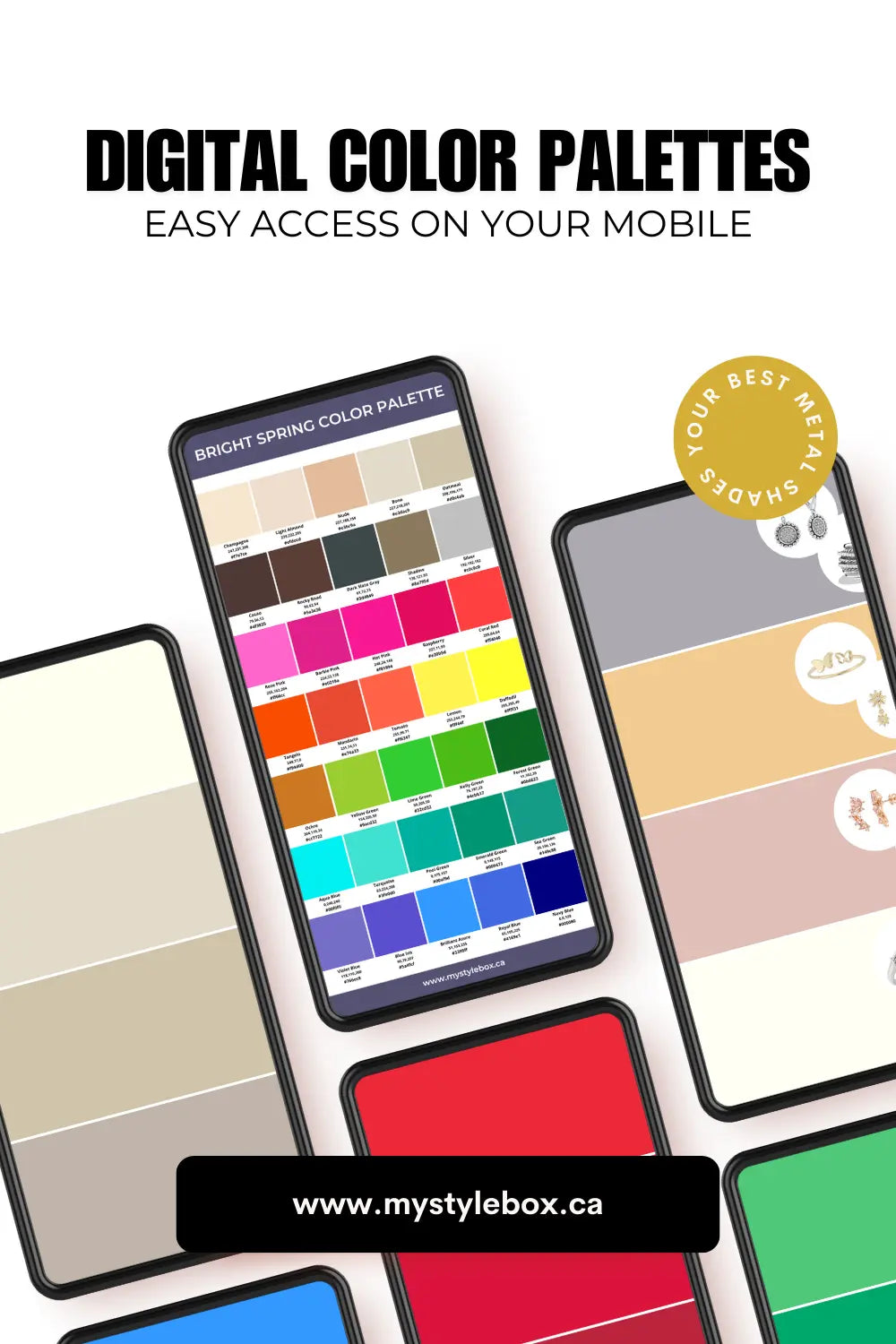
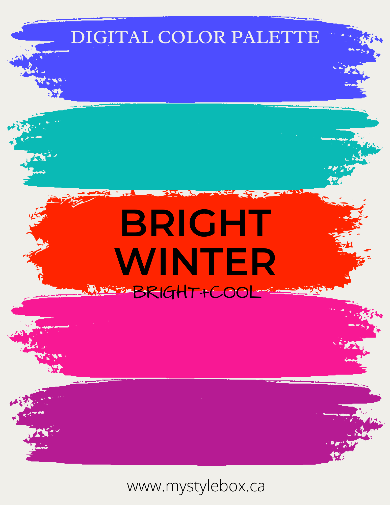
Bright Winter Color Palette

Undertone
Bright Winter is one of the boldest, most striking palettes within the Winter season. Defined by cool undertones, crystal clarity, and intense brightness, this season reflects the sharp beauty of icy landscapes, jewel tones, and the crisp, vivid light of a clear winter day.
Contrast
Bright Winters have high contrast between their skin, hair, and eyes — one of the highest contrasts found among all seasonal types. Their features are sharp, defined, and naturally striking. Often, the skin is light or fair, providing a crisp backdrop that makes darker hair and intensely colored eyes stand out clearly. Alternatively, some Bright Winters may have medium or olive skin with dark hair and bright eyes, still maintaining bold contrast within their features. Regardless of the color, there is always high contrast between the iris and the whites of the eyes.
This season combines the cool, icy undertones of Winter with the sharp clarity and brightness inherited from Spring, creating an appearance that is vivid, fresh, and unmistakably bold. Bright Winters can effortlessly carry saturated colors, bold combinations, and sharp contrasts without being overwhelmed.
Skin
Bright Winter skin ranges from fair to medium, often with cool, neutral-cool, or occasionally neutral undertones. The complexion appears clear, smooth, and luminous, with shades of porcelain, cool beige, fair olive, or light taupe being common. The skin may have a slightly cool, crisp quality rather than warmth or muted softness. It may have flecks.
According to the classic metal test, Silver is the most flattering for Bright Winters, enhancing the cool clarity of the complexion. Yellow gold is typically too warm and can dull the sharp contrast of Bright Winter features.

Eyes
Bright Winter eyes are the first to notice; they are vivid, clear, and highly defined. Common eye colors include bright blue, icy green, cool hazel, cool brown, or grey-blue, often with sharp contrast between the iris and the whites of the eyes. The eyes appear striking and crisp, perfectly complementing the bold, cool palette of this season. For detailed eye pattern analysis, click here.

Hair
Bright Winter hair is naturally dark and cool-toned, contributing to the season's sharp, high-contrast appearance. Hair colors typically range from dark brown to black, often with cool, ashy, or neutral undertones. Some Bright Winters may have slightly lighter hair, but always with cool, clear tones — never golden or warm. Compared to Dark Winter, Bright Winter hair tends to have slightly more clarity or sheen, enhancing the season's crisp, vibrant look.
"The same generally applies to brow hair," says Sara Millecam of Beautiful Brows and Lashes, adding that "The strong color contrast creates an intense look."

Bright Winter Celebrities

Katy Perry

Megan Fox

Adriana Lima

Alexandra Daddario

Lupita Nyong'o

Victoria Justice

Janelle Monáe

Courteney Cox
Image Source : Depositphotos
Dark Winter / True Winter / Bright Winter
Bright Winter sits on the seasonal flow chart between True Winter and Bright Spring. They have the coolness of Winter and are influenced by the brightness of Spring. Bright Winter colours are the brightest in the Winter family. They are cooler, lighter, and brighter than Dark Winters and more intense, lighter, and warmer than True Winters.
Neighbouring the Bright Spring, according to flow theory, makes the Bright Winter palette warmer, brighter and lighter than other Winters.

Dark Winter

True Winter

Bright Winter
Image Source : Depositphotos
Bright Winters and Bright Springs have bright colouring and high contrast in their features, but Bright Winters have a somewhat higher level of contrast than Bright Springs.
Bright Winters have cool (blue) undertones, whereas Bright Springs have warm (golden, yellow) undertones. Also, their colours are slightly darker than Bright Spring colours.


Bright Winter Color Palette
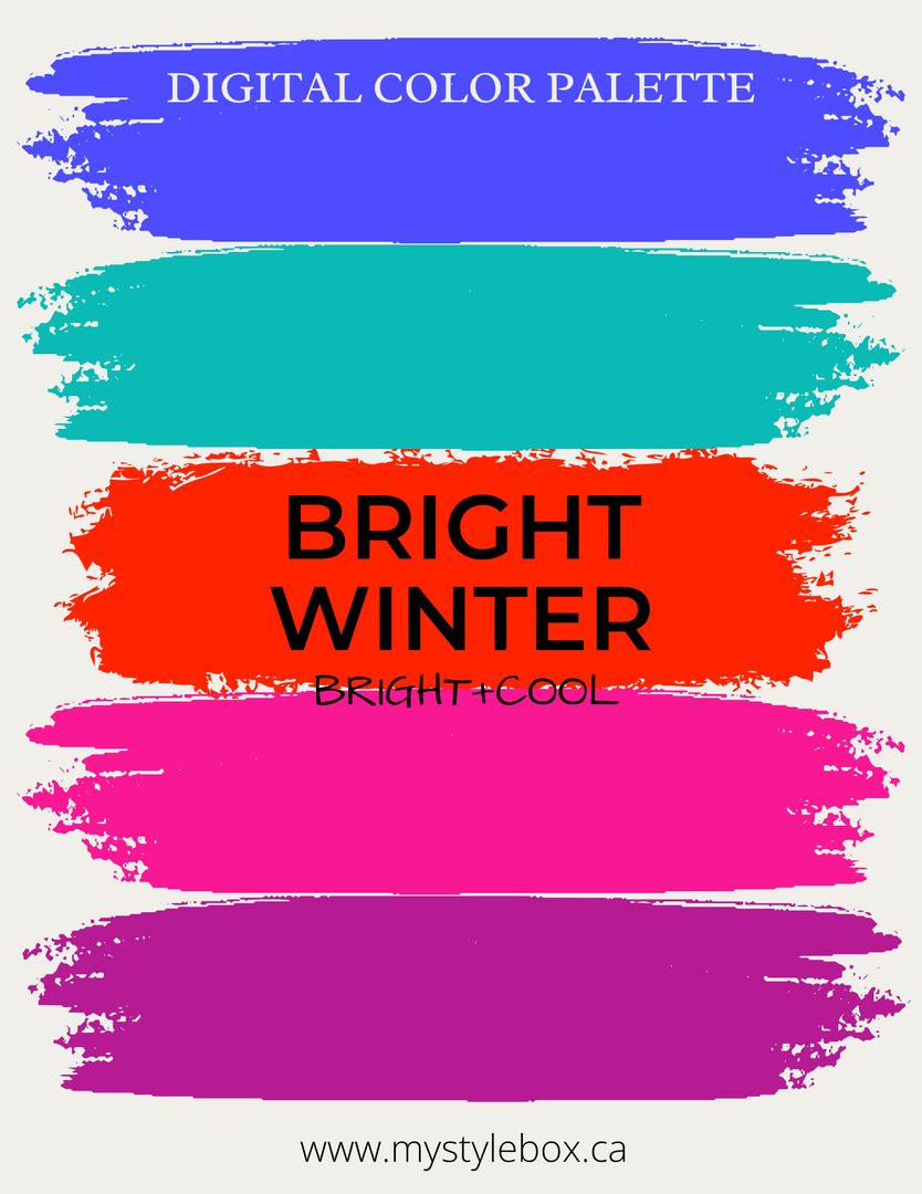
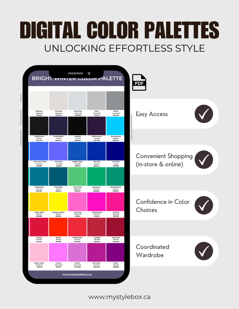

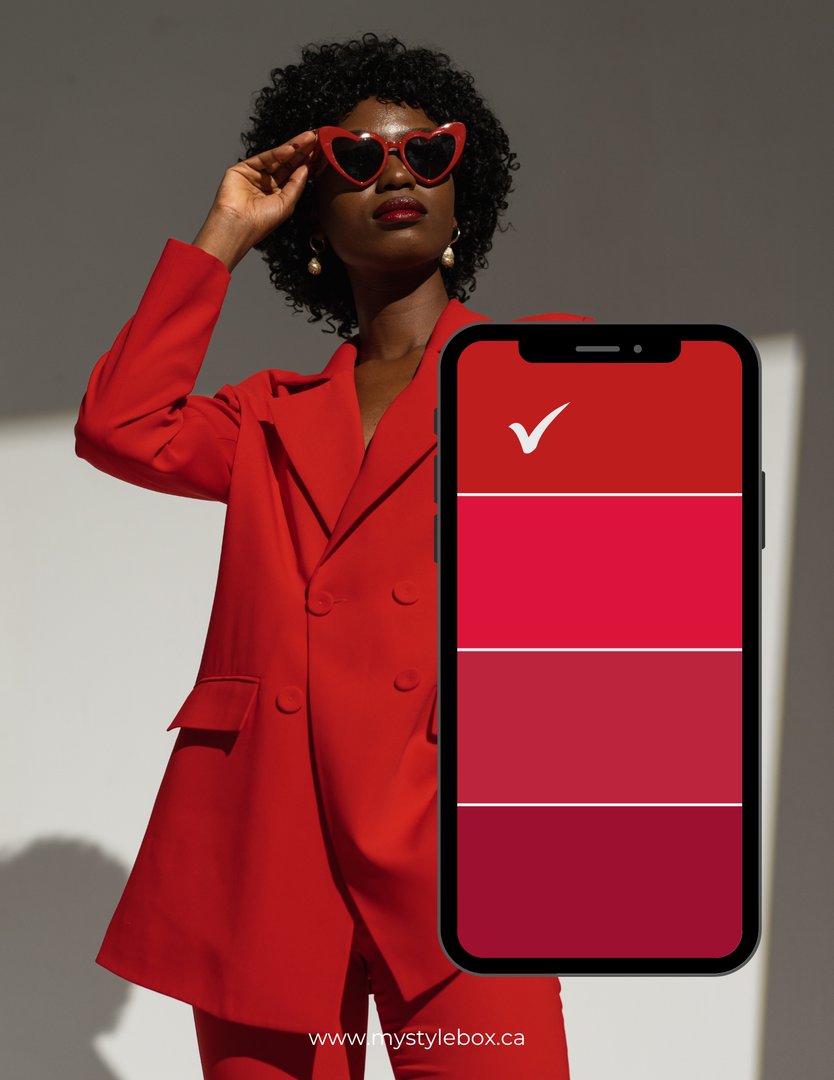


Bright Winter Seasonal Color Palette
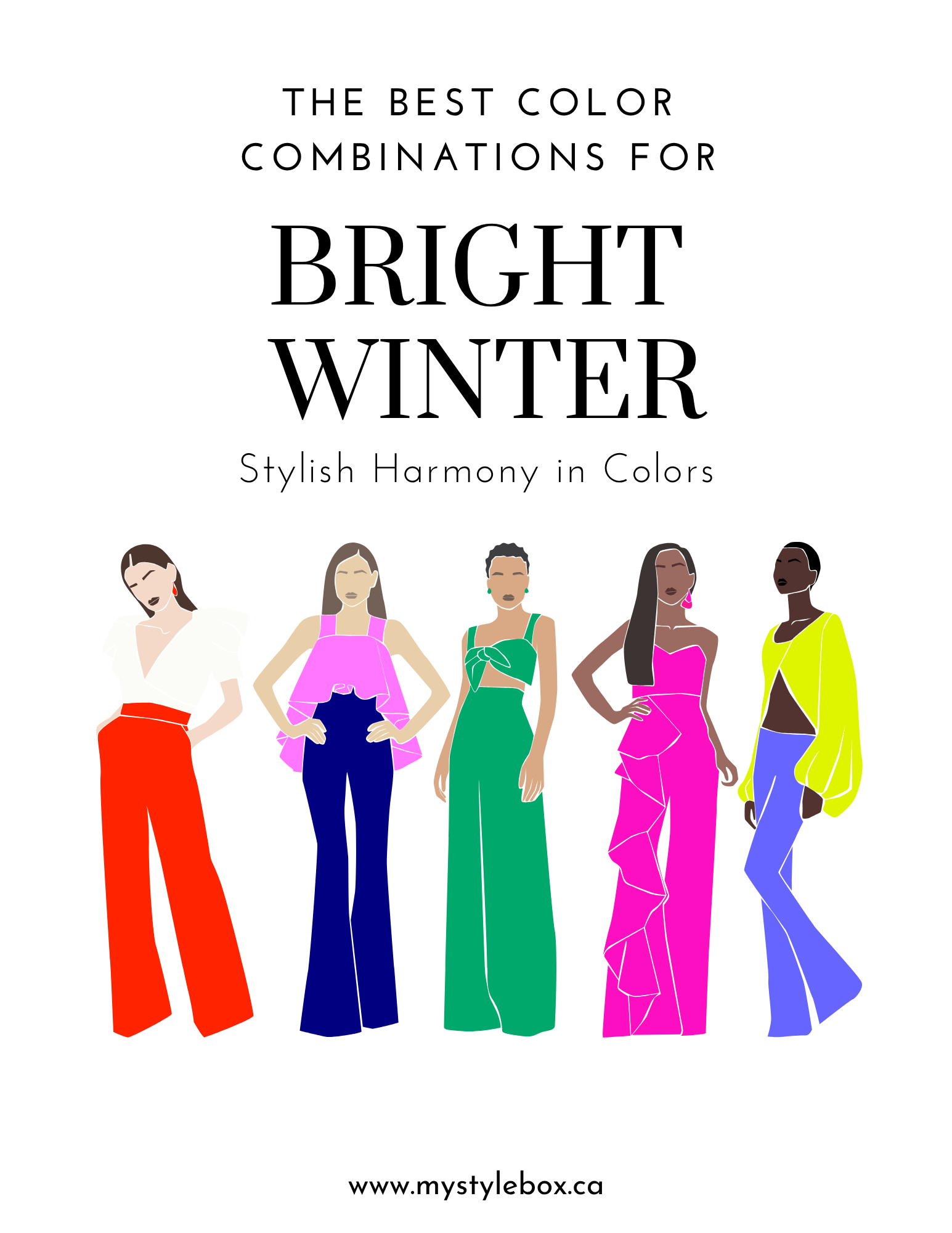
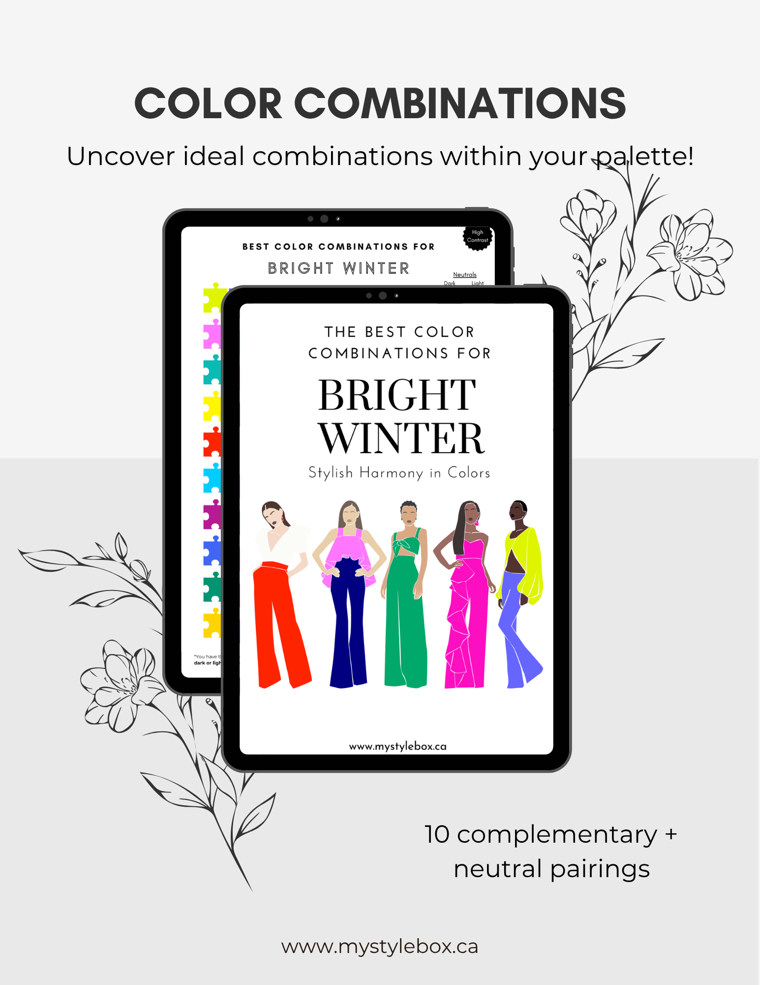
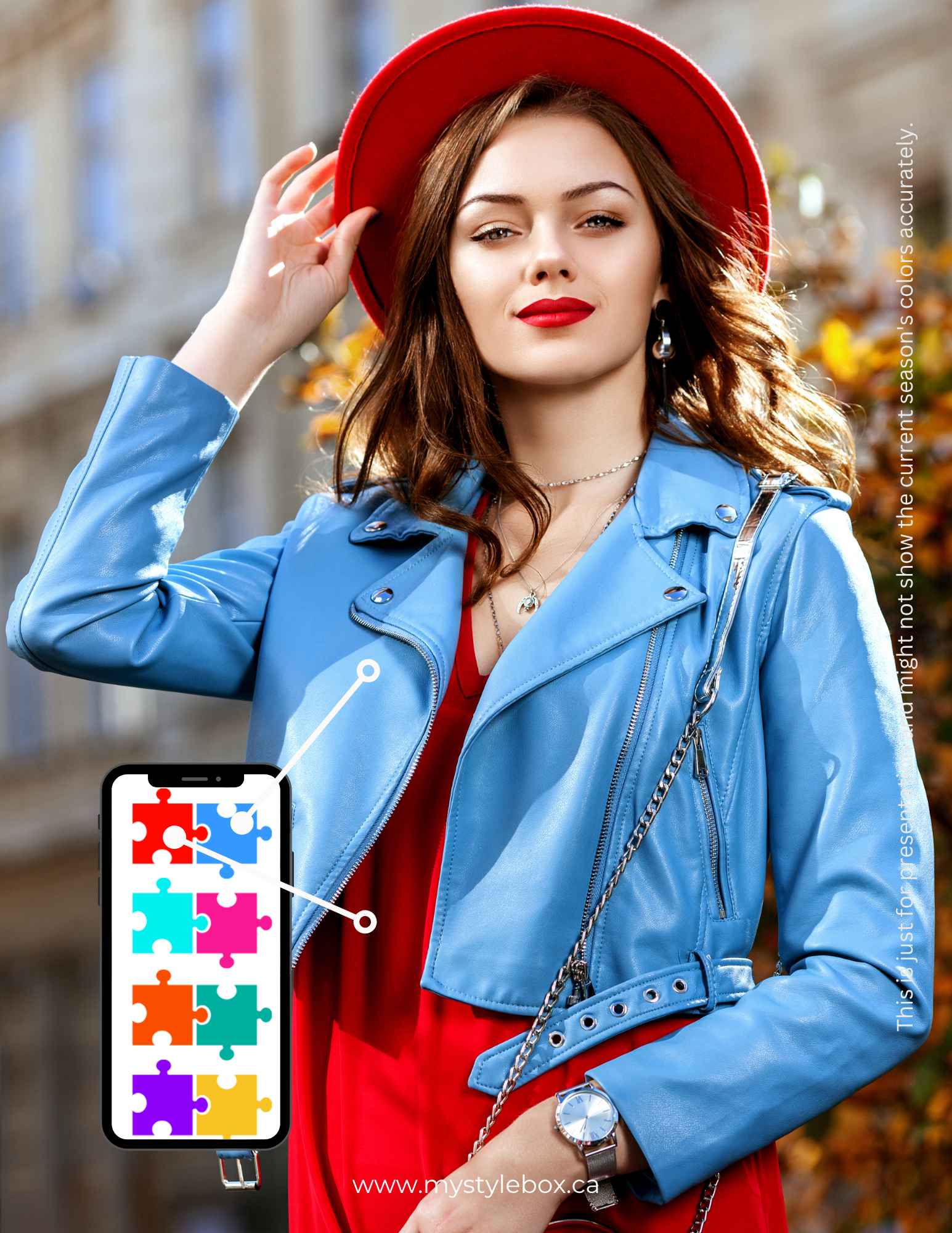
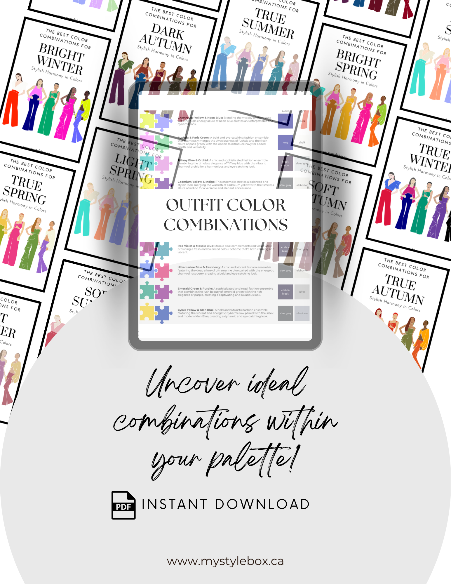
Bright Winter Color Combinations
Technically you can create color combinations by mixing and matching colors in your color palette. You can combine your accent colors with your basic colors or dark or light neutral colors.

Bright Winter represents a sub-season characterized by the most pronounced level of contrast, enabling the successful execution of bold and vibrant color combinations. Complementary, triadic, and tetradic color schemes are particularly well-suited for your palette. These combinations, due to their placement on the color wheel's opposite or widely separated positions, offer a heightened contrast and emit a striking and prominent visual impact.
When working with triadic and tetradic combinations, it is advisable to designate one color as the dominant hue while employing the others as accent colors to maintain a balanced appearance. Incorporating a mix of dark and light shades within your ensembles enhances the overall contrast. In place of using just black and white together, consider introducing an additional vivid color to amplify the intensity.
It's essential to avoid making black the primary color in your attire due to the neighboring influence of Bright Spring in your coloring. Your natural features are accentuated by Spring-like elements, making light and bright hues the ideal choice to enhance your overall look.
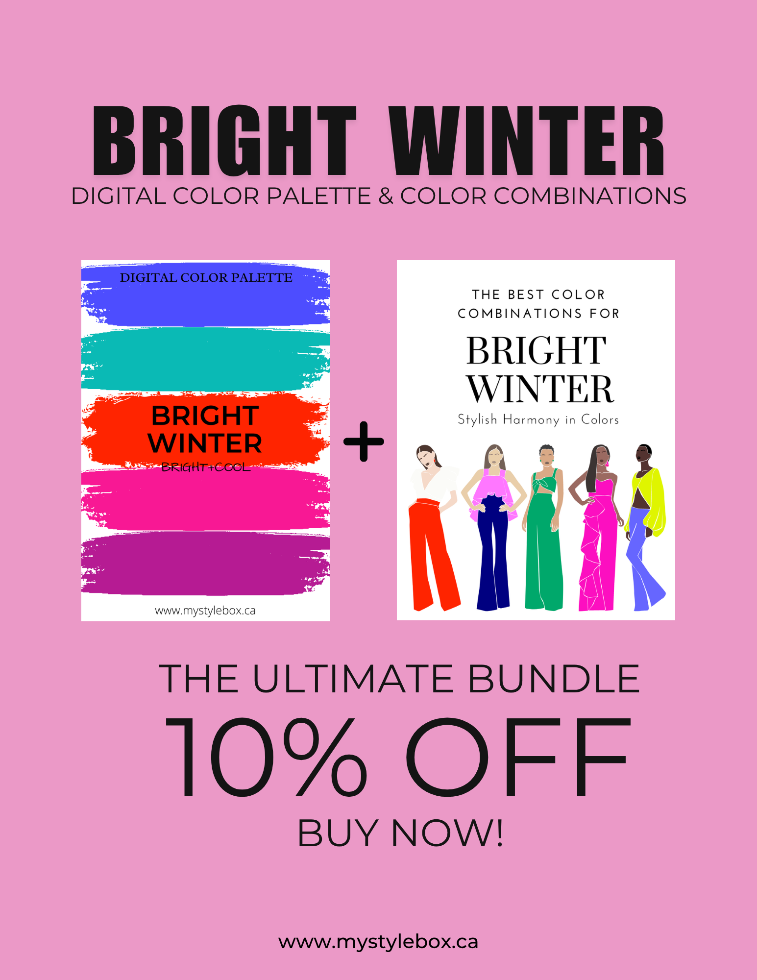
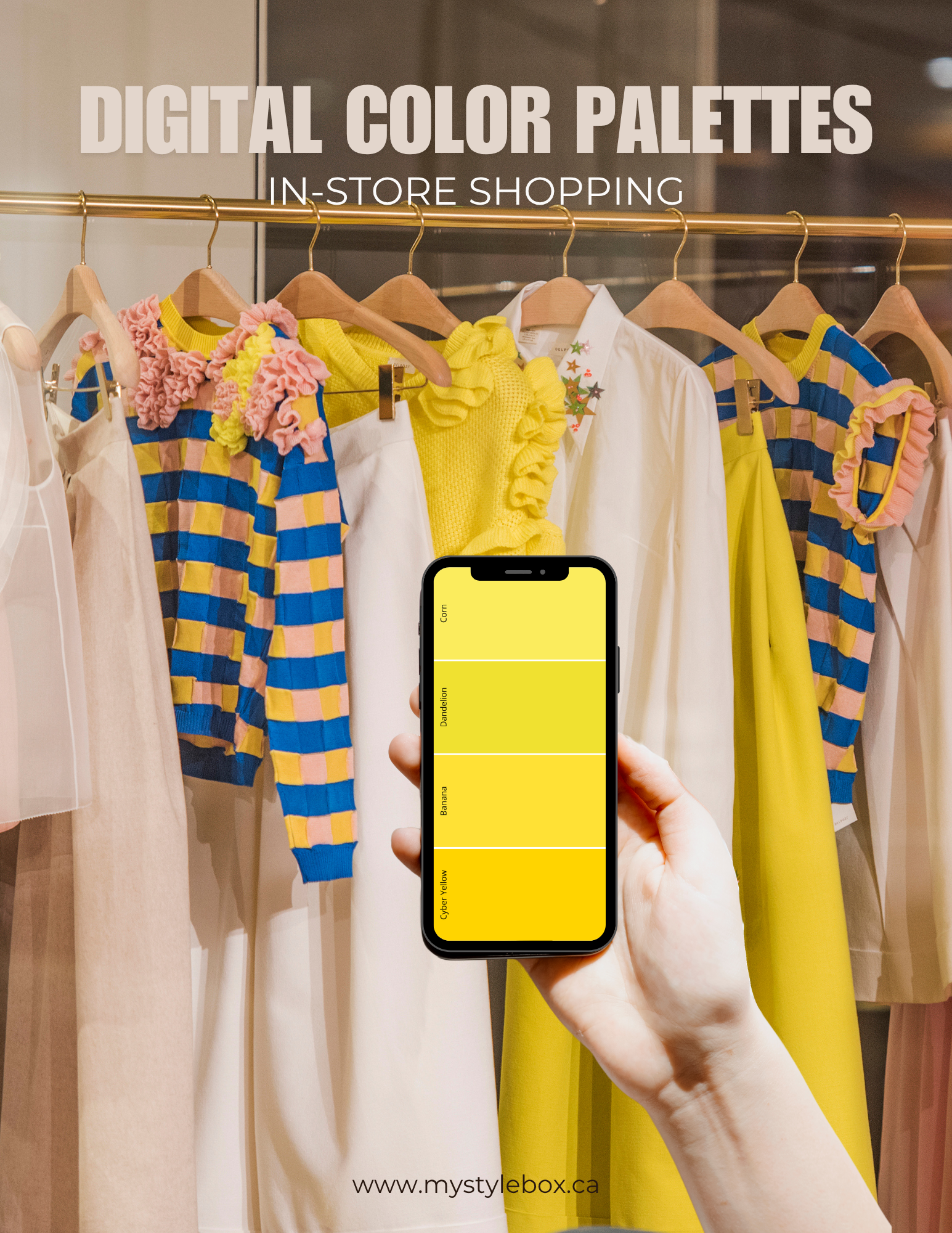


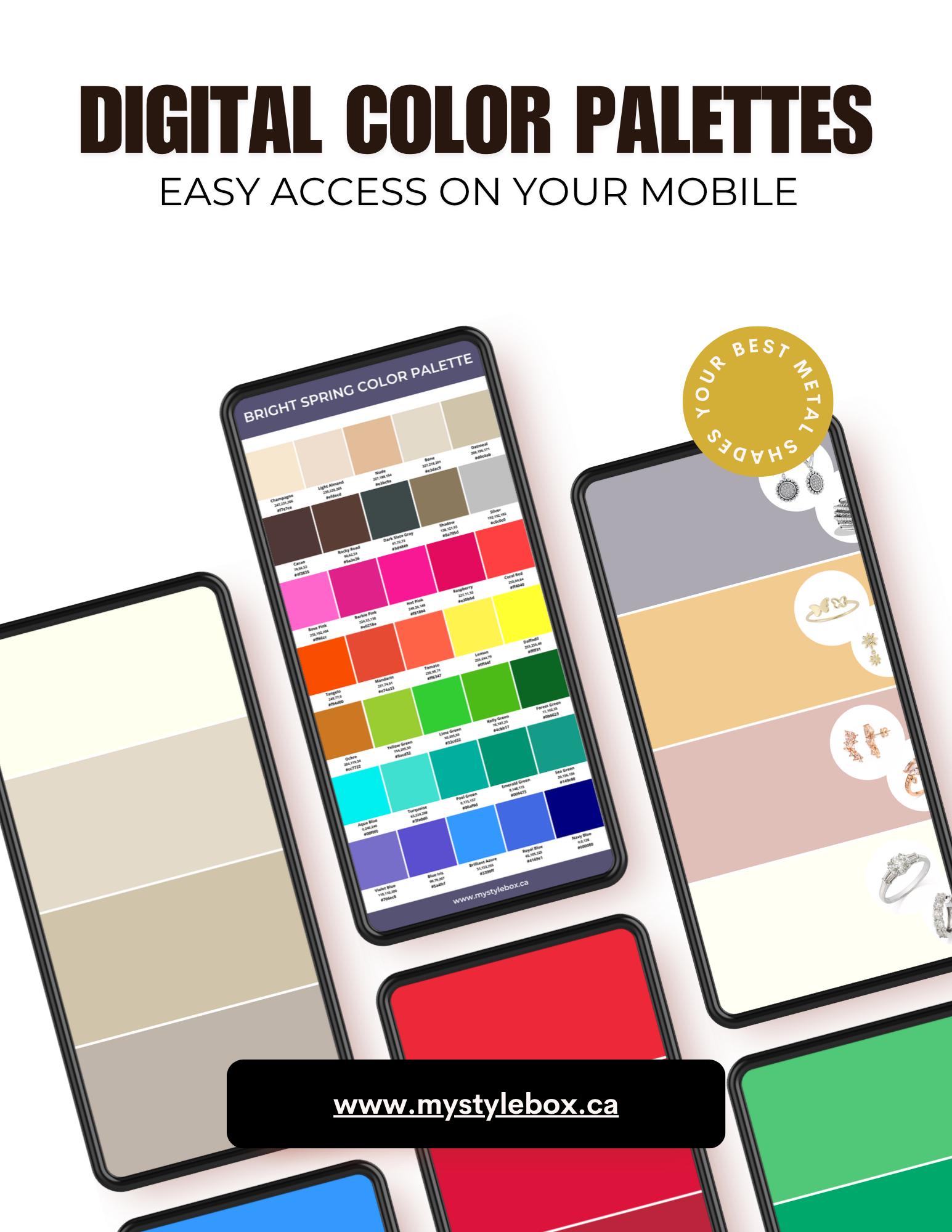
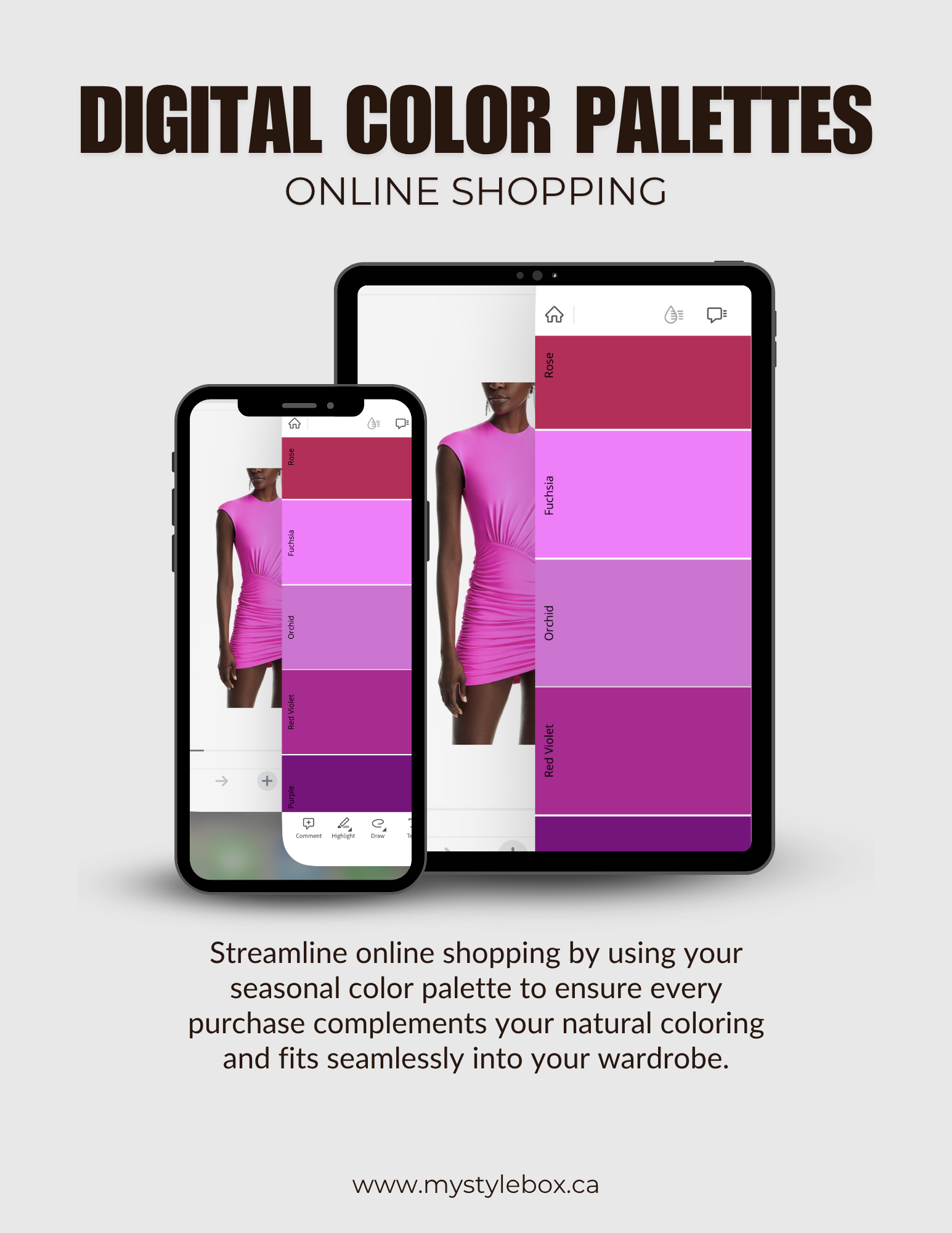

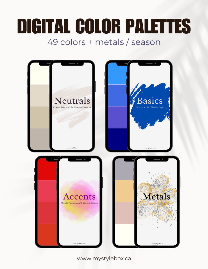
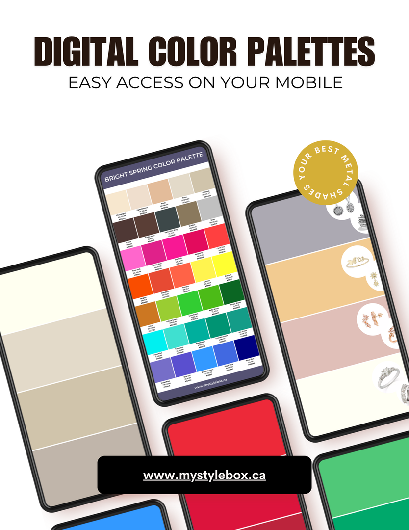
Bright Winter Season Digital Color Palette and Color Combinations
Patterns & Prints & Fabrics
Bright Winters have many bright and vibrant colours on their color plate. Therefore, there are many colorful pattern options available for your taste. Patters should contain only bright winter colors and have high contrast so that they can harmonize with your natural look.
Medium to large-scale patterns and prints would pop up the bright colours. Avoid faded colours and blended or minimal patterns; use bold, geometric, and abstract designs instead. If you like floral patterns, choose the ones on a big scale with bright colours.
Bright Winters look best in fabrics that enhance their bold, cool clarity. Opt for materials with a clean, structured finish, subtle sheen, or slight crispness to reflect your natural brightness. Ideal fabrics include silk blends, satin, crisp cotton, lightweight wool, fine knits, and structured blends. Bold prints, color-blocking, and high-contrast combinations work beautifully for this season.
Avoid dull, overly muted, or heavily textured fabrics, as they diminish your natural sharpness. Instead, choose bright, cool, and crisp materials that complement your high-contrast, vibrant appearance.
Similar pattern, different shades

Bright, Neon, High Contrast, Medium Scale, OK

High contrast, Dark and Light combo, OK

Medium Contrast, Faded colours, NO
Bright Winter patterns and prints


Please click here for more information about patterns and prints!
Explore our custom T-shirt collection tailored to your Seasonal Colour Palette!
Our BRIGHT WINTER T-shirt collection features colours that perfectly match your unique colour palette. Each design and pattern is specifically tailored to your colour season, providing you with a beautiful and one-of-a-kind wardrobe. Check Out All Seasons!

Jewelry
Metals: Bright Winter has neutral-cool coloring; the best metals are silver and platinum, along with white and yellow gold, provided they are light and shiny. These metals, especially when shiny, enhance the jewel-like quality of a Bright Winter's appearance, contrasting poorly with antiqued, matte, or brushed finishes.
Gemstones: Blue and pink Sapphires excellently highlight the cool brightness of Bright Winter complexions. Other superb choices include emeralds, rubies and diamonds. These gemstones complement the vivid and luminous traits that define Bright Winter styles.


Makeup

Seasonal Color Analysis : Find out your color season!
- Discover your color season to enhance your natural beauty, simplify your wardrobe coordination, save time and money while boosting your professional presence and confidence.
If you are not Bright Winter, check out the other seasons below!


 Spring Seasonal Color Guide")

 Winter Seasonal Color Guide")
 Winter Seasonal Color Guide")

 Summer Seasonal Color Guide")


 Autumn Seasonal Color Guide")
 Autumn Seasonal Color Guide")